So far, in our previous activities, all our work has only involved static images. This time around, we will be attempting to make use of videos. Since videos are simply a group of images stringed together in order to create a semblance of movement, all that needs to be done is to obtain the individual frames and process them using the techniques previously discussed.
What we will be processing this time around will be the dispersion of colored dye in different temperatures of water. A petri dish was filled with 30mL of water of varying temperatures. It was placed directly under a camera which was mounted on a tripod. A single drop of red food dye was dropped into the petri dish and a fifteen second video was taken of the dye’s dispersion. Below is an example of a frame extracted from the video

We will be using color segmentation to isolate the red dye color in the image and simply count the pixels in order to determine the area in each frame taken. The parametric method was used, but in this case, the cropped segment was only taken from the first frame. Since the dye is dispersing, the values within the cropped segment will change, and will affect the color segmentation in the final images. An example is shown below

If we apply the solution mentioned above, we are able to isolate a much better image.

The area of the color dye will be taken by simply counting the number of pixels, since the initial size of the dye drop cannot be controlled, we will only be observing the growth of the area after the initial drop. Another thing to consider is the shape of the drop. In order to explore the possibility of the shape’s relation to the dispersion, we also take the perimeter of the blob using the edge() function, as shown below

All that is left to do is to loop through the images for each video, compile the acquired data and plot them accordingly. The results of the area plots are shown below.

As we can see from the graph, the disperses slowest in the cold water and fastest in the hot water. The dispersion happens faster at the initial moments but then slowly tapers off. If we were to take a linear graph of the dispersion, we could approximate the dispersion at 627 pixels per second for cold water, and 823 pixels per second for hot water.
The graph using the perimeter produced inconclusive results. The graph below show that the dye in cold water had a large perimeter in the beginning, but then it slowly decreased. This can be due to it’s shape in which the gapes within the shape were slowly being filled out while not significantly increasing the area. It is also possible that the threshold used for the edge() was not appropriate, resulting in unwanted edges being counted.

For this activity, I will be giving myself a 9/10, as the objectives of the activity were met but submission was late.
In the past activities, we have worked with processing images in order to reveal or remove particular structures. The objective this time is the same, but instead, we will be using color segmentation to do this.
At times, color is the only clear indicator of certain structures within an image. Converting an image to grayscale could cause one to skip over certain values that would have been apparent if the RGB values were analyzed. As such, we attempt to incorporate the use of color in identifying certain structures, segmenting them according to color.
We first convert the image such that each pixel has 2 values that define its location in a normalized chromaticity space where (1,0) is red, (0,1) is green and (0,0) is blue as shown in the Figure below. We do this simply by plotting each R and G value over the sum of red green and blue for each pixel.

We attempt color segmentation using two different methods. The first is by parametric probability distribution. We will be attempting this on the image below, where we will try to isolate the red flowers in the image.

We first sample the image by cropping a monochromatic part of the image were we find our color of interest. We look for the Gaussian probability distribution function of the R and G values within the cropped area which we will use to segment the entire image. We compute for the probability distribution using the equation below

where sigma is the standard deviation and mu is the mean. We compute the same for the probability distribution of green and multiply the two together to get the joint probability distribution. The result gives us this image

The results have clearly captured the locations of the red flowers in the image, even revealing some harder to spot flecks of red throughout the image. If we were to increase the size of the cropped segment, it would result in the following

We notice that the result is now much lighter than the first result. By limiting the size of the cropped area of interest, we can restrict the segmentation of the image, providing a form of thresholding. By increasing the size if the cropped area, more values can then be displayed.
We then move on to the non-parametric method. In this method, we simply make use of the 2D histogram, plotting the values within the cropped image, and simply backprojecting it using the r and g coordinates originally obtained from the image. Displayed below is the histogram for the cropped image

If we compare it to the image of the rg chromaticity space shown above, we see that the image clearly occupies the red region. Using this histogram, we can then backproject by taking the grayscale value from the rg coordinate of each pixel in the original image. The result is shown below.

For some reason, only the outlines of the flowers were taken. Since the histogram obtained was okay, I can only assume that the problem here is caused by the backprojection part of my code. However, it is still worth noting since the results are only showing the edges of red, rather than red itself.
For this activity, I will be giving myself a 9/10, since the objectives of the activity were not completely met.
We continue with exploring the applications of morphological operations. This time around, we are making use of morphological operations to identify and isolate certain structures within an image, in particular, ‘cancer’ cells or circles that are slightly bigger in comparison to other circles in the image.
We start of with a plain image of circles as shown below. We take only a portion of it (size 256×256), since we’re only doing this to demonstrate the entire process and use the im2bw function to binarize it.


To clean the image, I used a 2×2 square structuring element, eroded the image a number of times, and then dilated the result by the same number of times. This process will get rid of the stray dots that we can see in the image. The result is shown below.

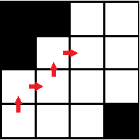
It is possible to further process the image in order to separate the connecting circles, but this will do for now. In total, we see seven white blobs. We want give these blobs separate values so when we get the histogram of the image, we can see the total area in pixels of each blob. Unfortunately, I still haven’t been able to make use of the IPD toolbox, so I made use of a clustering code that I had written some time ago for another class. The clustering code assigns a different value to each pixel that is ‘on’. It then compares the values to the adjacent nonzero pixels, copying the larger value. The end result is that each cluster will have a single value. It’s then a simple matter of reassigning values and then taking the histogram of the image.

As expected, we see seven bins with values (I had already removed the zeros and increased the number of bins in order to space the bars in the histogram). The larger two represent the blobs of three circles that had clustered together while the rest represent individual circles. From this histogram, we can estimate the average size of the regular circles.
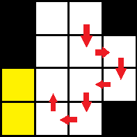
We then move on to isolating the cancer cells. The image is filled with circles, some being cancerous, or slightly larger than average. We do the same as above by taking only a portion, one that has a cancer cell along with regular circles, binarizing the image, cleaning it with erosion and dilation, and then clustering it.

We take a look at the histogram. This time, we are looking for a value that is only slightly bigger than average. We will ignore the larger two because we can tell that it is simply the combination of two or more circles.

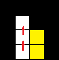
The first bar on the left is the bar that represents the area of the cancerous cell. We take note of its area and then filter the image to show only clusters with that size range. The result is as follows.

Now that we are capable of isolating a cancer cell in a portion of the image, we can just apply the same to the entire image. However, this was the result.

Other than the five cancerous cells, other clusters composed of two connected circles also appeared. It is possible to avoid this result by performing more erosions and dilations, but doing this too often can lead to loss of data. Instead, from this image, we apply a single erosion with the structuring element being the size of the cancerous cells. With that done, we then have a bunch of points localized at the centers of the cancerous cells. We add this to the image above, run the clustering function again so that the added values will cover the entire blob, and then filter the structures with lower values. The final result is shown below.

Having achieved the objective, but being a little late in posting, I will be giving myself a 9/10 for this activity.
We now attempt to apply the techniques of morphological operations to create a singing program. Scilab is capable of producing sounds of certain pitches using the function sound() and by varying the frequency and time input. Utilizing this, along with application of morphological operations, we will try to have the program read an image of a musical score and have it sing appropriately while minimizing the need for human input.
I obtained a jpg file of the song jingle bells from the internet. We invert the image so that it becomes white on black, in order to make the processing simpler.

Our two concerns are as follows: identifying the location of the notes in relation to the staff, and recognizing the type of note. The position of the notes will dictate the tone of that particular note, while the type of note recognized will determine how long the note will be sung.
In order to identify the notes, we need to sample the music sheet itself. However, the notes need to be retrieved independent of the staff, so it is not a simple case of cropping the image. In order to retrieve the images of the notes, we simply erode the image with a vertical structuring element, enough to remove thin horizontal lines. After which, we simply crop the different images of each type of note. We do the same for the rests that appear. It should be noted that each type of note should be sampled, meaning if a note is not consistent throughout the image, more samples need to be taken.

Now that we have reference images as to what the notes look like in that particular music sheet, we can then proceed to locate the locations of each note type on the image. We can do this by simply eroding the image using the notes as our structuring element. However, we do encounter a small hiccup. The half note, when used as a structuring element, also picks up the locations of the eighth notes and the quarter notes. The quarter note also picks up the eighth notes. We remedy this by performing a form of NAND operation of all the notes with overlapping notes. Meaning should the locations of a half note and a quarter note coincide, the half note will delete this location. However, it may also be possible that the points are separated by some distance due to the nature of the structuring element. If this were the case, the locations do not overlap and the NAND will be useless. We remedy this by performing a small scale scan in the immediate surroundings, locating if there are points that are too close.

Locations of half notes (left) and quarter notes (right). Points have been enhanced for visual purposes.
Another thing to note is that since we are using the eroded images of the notes, its possible that two adjacent points appear. We simply pass the resulting image through another erosion (with a conditional to ignore already singular pixels) and we are left with singular points.
At this point, we have identified the different notes in the image and have localized them to certain points in the image. Now we need to figure out a way of correlating these locations to the location of the staff. We start by localizing the staff. Similar to how we located the notes, we just sample the staff and erode the entire image with it. The result should be points indicating where the staff is.
A little calibration is needed at this point, particularly in my case since the erosion function I have been using is my own personal code. By comparing the location of the staff point and the location of the note point and referring to what that tone that note plays, we now have a basis for the calibration of the different tones. Once this is done, the program then simply compares the distance of the note point to the staff point and it can already designate an appropriate frequency. It should be noted that it is best that the program be calibrated for each sampled note. Differences in the size and appearance of the sampled notes may cause changes as to where the localizing point will appear. For the rests, these do not need to be calibrated to the staff, as we simply assign them a frequency below the audible range.
After this, we scan the image in relation to the staff position and build a sound matrix, following the notes. The result is these sound files (separated due to size restrictions in Scilab).
https://www.yousendit.com/download/TEhYRkJVNkdrWTlMWE1UQw
https://www.yousendit.com/download/TEhYRkJVNkdveE1UWThUQw
https://www.yousendit.com/download/TEhYRkJVNkdvQUxxYk1UQw
The resulting music is mostly correct with only a few off-key notes. But other than those few notes, the program was successful in reading the music sheet and playing the corresponding music.
I should note here that I only had access to the SIVP toolbox of Scilab. As such, the methods used in order to obtain the goals may seem a bit roundabout compared to other methods. Still, despite the crude method and over 800 lines of code, the method is still viable. The only necessary times when human input was needed was during the sampling of the images and the calibrating of the notes. Other than this, the program is hands-free.
One huge drawback to this program is the time necessary to run it. The longest part of the code is localizing the notes which would take about 50 mins for each sampled note pair (upright and upside down notes) for a 789×959 image, and the code was already optimized to search in the immediate area of the staff. In this case, I had 5 note pairs and and the rests. To run the program, at least from the point where the notes have already been sampled, would take well over 4 hours. This can be improved by reducing the number of sampled notes. As mentioned earlier, there are cases when notes do not resemble each other exactly. A possible remedy would be to modify the erosion such that instead of outputting a binary result, is to output a grayscale result with the value reflecting the similarity between the structuring element and the location on the image.
For this activity, since I was a little late late in posting this, I will be giving myself 9/10.
Having previously discussed morphological operations, we now attempt to apply this in certain areas. In this particular case, we will attempt to extract text from a scanned document, both handwritten and printed, and reduce it to lines of single pixel width.
We first obtain a scanned image of a document, as shown below.

We edit the image using GIMP 2 such that the lines on the page are properly horizontal. A potion of the above document is then selected for processing. Having selected a portion of the document, we apply what we have previously learned in signal filtering in order to remove the horizontal lines on the document, leaving an image with the text more apparent, as shown below.

We now work on how to binarize the text. We convert the grayscale image above into a binary image using im2bw() and then invert the image in order to simplify the use of morphological operations. The threshold value needs to be chosen very carefully at this point. Too high and crucial information is lost. Too low and the the data becomes noisy.
Once we have chosen an appropriate threshold value, we now have our very messy binary image. There are two things we would like to do at this point. Dilate the image so that portions that need to be closed are closed, or erode the image to remove unwanted connections.
In this case, we start with the latter. I modified my personal code for erosion such that it repeatedly erodes all points until a signal pixel is left. Once we are left with the single pixel, the erosion function will skip over that point. Pairing this erosion function with a small horizontal structuring element and a small vertical structuring element, we are able to reduce the image to vertical lines and horizontal lines.
I did this because I had the idea that reducing horizontals to a single pixel would be an easy way to get rid of the unwanted thick lines. If I were to accidentally get rid of an important horizontal line in the process, the result of the vertical erosion would compensate and resupply this information. The result of these two erosions combined is shown below.

For some reason, the result was the outline of the text. It may have been a result of how I modified the erosion code, but this result wasn’t entirely unexpected. Still, this wasn’t what we were looking for. We discard this result and simply make use of one erosion direction.
At this point, there is no straightforward way of further processing this image. Of course, the image can still be improved, but there is no longer any one-size-fits-all method. In general, we will have to alternate dilating and eroding the image with different structuring elements. The reason for this is that if we were to continuously dilate the image, we would also be connecting lines that should not be connected. By dilating only enough to connect what needs to be connected, then backpedaling with erosion to remove the residual effects of dilation, we can further improve the image quality.

Above is the final result. While the handwriting is not clear, it has achieved the goal of reducing parts of the text elements into binary of pixel width. As I have only achieved part of the activity’s goal, I will be giving myself a score of 8/10.
When processing images, the raw images may contain more information than what is needed, or in other cases, less information then what is needed. An image may be noisy, containing to many random artifacts, or perhaps it may be too sharp that some data is lost on the edges in the image. To deal with these problems, we make use of morphological operators.
The activity we will be performing centers around the morphological operations of erosion and dilation. Both operate by comparing a pixel and the pixels surrounding it to a structuring element. Erosion would remove pixels and dilation would add pixels depending on the overlap of the image and the structuring element.
We focus on binary erosion and dilation for this activity. We create 4 different binary images, a 5×5 square, a triangle with a base of 4 units and a height of 3 units, a 10×10 hollow square having an edge 2 units thick, and finally a cross with leg length of 5 units and 1 unit wide.

For each of these images, we perform both dilation and erosion with the following structuring elements.

However, before we begin with processing these images using a computer, we first attempt to predict the outcome by drawing all the images.
Having drawn the initial image, we overlap the structuring element. Take note that for a structuring element, there is a point in question which will change in value depending on the result of the morphological operation. In the case of a square structuring element, we can designate the upper-left corner as an anchoring point. When performing dilation, as long as part of the structuring element overlaps with the binary image, the pixel in question will become one. When performing erosion, the pixel in question will be zero unless the entire structuring element is within the binary image.

In the example above, the green structuring element overlaps with the red image. If the process being performed is dilation, the blue pixel in question will become one (considering a binary operation). However, if the process being operation being performed is erosion, since the whole of the structuring element is not within the image, the blue pixel in question will remain zero.
This process is repeated for every point until the structuring element has scanned the entire image. Hand drawn predictions were made for all images for all structuring elements.
Now that we have an initial prediction of the results, we can now process the images using a computer. Since the SIVP toolbox in scilab does not have functions for morphological operations, two independent results were taken to validate the data. One using Matlab, and one using a code that I wrote using some SIVP functions.


Below are the hand drawn, Matlab, and Scilab results for all images for each structuring element.

Above are the results for dilation with a 2×2 ones structuring element. Each dimension was enlarged by one unit as a result of the operation.

Consequently, the same structuring element reduces the size of each dimension by one unit when erosion is applied.

Reducing the structuring element to a 2×1 ones matrix, dilation elongates the image in the horizontal direction.

Conversely. performing erosion with the same structuring element reduces the horizontal length of the image. Most evident in the cross image, all that remains is a horizontal bar.

Changing the orientation of the earlier structuring element into a 1×2 ones matrix, dilation stretches the image in the vertical direction.

Again, the opposite happens when applying erosion, reducing the vertical components of the image by 1 unit.

A cross-shaped structuring element was used in the above results. One can easily replicate the dilation results for this by simply scanning the points of the image and adding a one above, to the left, right, and below each pixel.

The results for erosion on the other hand, show how many pixels have adjacent ones in all 4 directions.

A diagonal structuring element used in dilation results in an image as if the original image was displaced diagonally and overlaid on each other.

On the other hand, performing erosion with the same structuring element identifies how many pixels can be found diagonal to each other.
The results for Matlab and for my personal code appear to be similar and match the expected hand drawn results. One noticeable difference between Matlab and my personal code is that the results seem to shift for certain images. We can attribute this to a different point being used as the pixel-in-question in the structuring element. Another thing to note is that the Matlab code used was not specified for binary morphological operations, therefore, one can perceive certain gray spots outisde the expected image.
There are some considerations that need to be taken when using morphological operations. First, it is ideal that the image being processed shold have a large enough background of zero information such that the structuring element can fit within the zero background without overlapping the image. The minimum allowed would be an overlap of the edges. A larger overlap would reduce the scanning of the structuring element and therefore reduce the information obtained.
Another consideration, at least when applying my personal code, is the size of the image. Since my code uses 4 nested for loops, given a large image, the time needed to process the image would increase drastically, making it inefficient in such cases.
For this activity, I will be giving myself a 12/10 since the objectives of the activity were met and I was able to explain the considerations one would need to take into account when performing these operations. The original code written, also shows a decent amount of comprehension on my part.
The activity is primarily concerned with improving an image’s quality by filtering unwanted elements in Fourier space. We will tackle this in two parts: familiarizing ourselves with the Fourier Transform of multiple elements (through convolution theorem) and finally applying it to actual images.
Before we start with convolution, first we need to familiarize ourselves with the Fourier Transforms of common shapes. Below is a table of figures that show some common figures and their Fourier transforms. Radially symmetric Dirac deltas produce a sinusoid along their common axis, a circle will create an Airy disc, and a square will result in a sinc function in both x and y axes. It should also e noted that a wider image will be further reduced in Fourier space. This is why a gaussian with high variance will appear small in Fourier space.

Now that we know this, we can make use of the convolution theorem.The convolution theorem says that the Fourier Transform of a convolution between two functions is the same as the product of the Fourier Transform of those two functions. Take for example the images below and their Fourier Transforms.

The two circles in the image can be taken as the convolution between two radially symmetric Dirac deltas and a circle. Applying the convolution theorem, the Fourier Transform of the image should be the product of a sinusoid and an Airy disk, which we observe in the image above, where the sinusoid and the Airy disk are combined into one image. Decreasing the distance between the two Dirac deltas would change the frequency of the resulting sinusoid in Fourier space, and this remains true when applying the convolution theorem. The same is true for the inverse proportionality of sizes between real space and Fourier space.
Below are a few more examples of a Dirac delta convolution with squares and gaussians:

 Using the convolution theorem, we can easily make a convolution of two individual images. Following the theorem, one would simply need to take the inverse Fourier Transform of the product of the Fourier Transform of the individual images. We demonstrate this by creating an image with random points and an image of a 5×5 pattern in the center.

We take the individual Fourier Transforms of the images as shown below.

Multiplying the two images together point by point and taking the inverse Fourier Transform, we achieve the final result,

The convolution looks as if the 5×5 pattern was smeared onto each of the random points in the original image.
We also observe the Fourier Transform of equally spaced points along the x and y axis. Shown below are the patterns in increasing distances between points and their corresponding Fourier Transforms.

As we can observe from the image, the number of lines appearing in Fourier space increases in proportion with the distances between the points. The first column, where the points are separated only by one pixel, have produced only one line per axis. On the other hand, the last column, where the pixels are separated by 99 pixels, produce so many lines that it is a serious chore to count them manually.
Now that we are comfortable with the convolution theorem, we can move on to improving image quality by manipulation in the Fourier space. If a certain artifact is present in an image, and this artifact has some form of pattern throughout the image, this pattern will manifest itself as certain points in Fourier space. By filtering these points, we can remove them from the original image.

Our first example is the picture of the Lunar Orbiter image. Present in the picture are horizontal lines, which are the result of combining different frames. Since the artifact we are observing is limited only to being repeated along the y-axis, we can already predict that the points we will be filtering are present on the y-axis.

Above to the left is the Fourier Transform of the image. The central mask is there in order to make the other artifacts more visible. As expected, we observe equally spaced points along the y-axis. We take note of their coordinates and zero them, as shown in the image to the right.

With the unwanted frequencies removed, it is a simple matter of performing an inverse Fourier Transform. The resulting image has greatly improved compared to the original, though there are still minor traces of the horizontal lines.
We try again on another image, a picture of a painting on woven fabric. Our goal this time is to remove the artifact caused by the weaving on the fabric surface.

Observing the weaving pattern, we note that repetition can be seen in multiple directions. Unlike the previous image, where the artifacts were limited to the y-axis, we expect our points of interest to be scattered about the Fourier space. We take the grayscale of the image so that we are only working with a 2D matrix of values and use a Fourier Transform.


The above image is the Fourier Transform with the center masked. We are able to observe distinct points surrounding the center, and it is these points we will be filtering. Once filtered, we take the inverse Fourier Transform to obtain,

The image above is the frequency filtered image. As we can see, the processed image, though still retaining minimal details of the weaving, has been greatly improved as compared to the original.
Since the processing isolated the weaving pattern, it is also possible to reconstruct it. Inverting the mask used on the image and performing an inverse Fourier Transform, the results is:

The image above is a magnified center of the inverse Fourier Transform of the mask. As we can see, it does resemble the weaving pattern on the original image.
It is worth noting that one need not restrict himself to grayscale images when filtering frequencies. Given a truecolor image, simply separate the red, green, and blue channels and process them separately. Unless the artifact is something restricted to one channel, the same mask can apply for all channels, and even if this is the case, using the same mask should not affect the quality greatly. Below is a processed color image with each channel processed using the same mask.

For this activity, I will be giving myself a 12/10 since I was able achieve the desired results and was able to explore filtering color images.
The objective of the activity we are about to discuss is to manipulate an image through the values of its histogram. As we already know, pixels in grayscale images are assigned levels from 0-255, with 0 being the darkest and 255 being the lightest. Calling a completely white image would give us an 2D array of 255s while a black image would give us an array of zeros.
The manipulation of the image is primarily concerned with the histogram of the gray values in an image. Say that a picture is taken in the dark. The result would be that most of the pixels in the image would be assigned lower values, which would be made apparent in the image’s histogram. Below is an example of a dark grayscale image and its point distribution function from its histogram.


As we can see from the images, the number of counts on the histogram are higher on the left end of the axis, meaning there are more pixels with lower values. We take the values from the histogram and arrange it as a cumulative sum. This gives us the cumulative distribution function(CDF) of the image.

We now decide for a shape for our desired CDF. We want to improve the image by shifting the darker pixels to lighter ones, but we do not want to shift them too far or this will result in different levels crowding into a single gray level, particularly at higher values. We also want the shift to be proportionate to their original values. These requirements help to pick an appropriate shape for the CDF.
Since the image CDF looks like a logarithmic function, we plot our ideal CDF as a logarithmic function with a lower incline.

Now that we have our original CDF and ideal CDF, we need to create a translator saying that all pixels with x1 gray level will then be changed to x2 gray level. We do this by backplotting, that for every x-value in the original CDF, we look at its y-value, find the closest existing y-value in the ideal CDF and take the x-value. This was done by assigning the y-value of the original CDF to a variable. Using the find function, I located the indices for which the y-value was greater and the indices the y-value was smaller. I would then simply compare if the last of the smaller values or the first of the greater values to see which was closer to the y-value. Whichever was closer would be the corresponding point. Below is an example of the plot of the resulting translator.
![]()
Translator for the logarithmic function
The plots above show the translation from x1 to x2. A straight slope means no change, a high slope means a shift to higher values, and a low slope means a shift to lower values. We simply apply this translator to the image and we have our final result.
The two images above are created using two different logarithmic CDFs, with different slopes. The more we slope the ideal CDF away from the original CDF, the lighter the image becomes. However, this results in the higher values crowding the remaining gray levels, resulting in quantization error. This is apparent in the lighter areas of the image.


Suppose we chose an ill-fitting CDF for the histogram manipulation, the result would end up translating pixels to disproportionate levels, resulting in an increased occurrence of quantization errors. The images below show a linear CDF, its translator and the results.

Original CDF and ideal CDF
![]()
Translator from the CDF

Result from linear ideal CDF.
Having successfully manipulated the histogram of the image, we want to look at the new PDF and CDF of the image. Below are some examples.

Logarithmic CDF applied

Linear CDF applied
We can see from the above images that histogram of the image has changed such that there are now numerous values with zeros, resulting in a plot with a jagged appearance. We also note that the CDF attempts to imitate the applied ideal CDF. Both are the effects of quantization error.
We also perform histogram manipulation on the same image using GIMP 2.8. Using the same shape CDF on the image, we achieve a similar result as shown below.


Having achieved the results of the activity, and giving a sufficient discussion on implementing the histogram manipulation technique, I will give myself a grade of 11/10 for this exercise.
The objective of the activity was to mechanically obtain the area of an image by using Green’s theorem on the defined edge of an image.
To illustrate the process, I generated bitmap images in scilab, a circle and a square, white on black.

After creating the above images, I used the edge function to get the outline of the synthesized shapes, resulting in the following images

After this, all that needs to be done is to write a code that follows the edge and inputs the x and y-coordinates into the Green’s theorem. Normally this code would be a simple case of creating a number of sequential if statements that searches up, right, down, and left (we ignore the diagonals in the interest of simplicity) for nonzeros.
However, this method could cause problems. Should the edge in the image be composed of more than one layer of nonzeros, this method is more likely to travel back on itself, therefore not completing the edge and possibly not returning to the original point.
I remedied this by writing a program that followed the edge by latching on to an adjacent zero. In such a case, no matter how large the edge is, the edge tracing will always stay at the very edge. Another convenient point to the new program is that it actually works even without separating the edge from the original shape. As long as the edge is consistently nonzero, against a zero background, the program will be able to travel the edge even if the body of the shape is still entirely white.
Another important part of the program is the marking of previously traveled points. This is easily done by creating a parallel zero array, marking certain points as ones as the program travels past them in the edge image, and creating a conditional statement that would compare the next step to the parallel array with a conditional stating to not move to any point that has already been marked.
However, this part of the code also introduces another problem. Not allowing backtracking could lead to a dead end given sharp edges in the image. Because of this, we limit the used images to very simple shapes.
The results for the areas of simple shapes did not accurately match the expected results. Particularly for a square test image, the result would always be that of one that is smaller by 1 unit on both axes. However, computing the results manually produced the same results as the code, meaning that the code is functioning properly, at least in the intention with which it was written.
An image of the grounds of Veteran’s Memorial Medical Center was taken from googlemaps and was edited such that the inside was colored white and the background was black.
However, when the program was used, multiple errors appeared and the program kept getting stuck on infinite loops. Because of this, I was unable to obtain an estimate of the area. Because I was unable to obtain the desired results, I will give myself a score of 8/10.
Digital images can come in many different forms based on the properties of the image, on how the data is stored or represented, or how the image is used.
The most basic image type is the binary image. The entire image is simply composed of 1s and 0s, creating a pure black and white image with no graylevels. It is a very compact way of representing an image since the data is represented so simply. Below is an example of a binary image:

Another image type is the grayscale image. Similar to the binary image, it also shows images with black and white, however, italso allows variation between black (represented as 0) and white (represented as 255), allowing varying levels of gray in between. Below is an example of a grayscale image.

Truecolor images are able to display images in full color by representing each color with values for red, green, and blue for each pixel. The result is a 3d image, or rather, a 3-layered 2d image, each layer containing values for red, green, and blue. This image type allows for large color variation, at the cost of increased file size.

Indexed color images, like the truecolor images, are able to represent color images. However, instead of having a 3-layered image with each layer for red, green, and blue, Each pixel is represented with a value which corresponds to the index of a particular color. The result is an image that requires less space, but has less flexibility in color representation, as shown below.

The above four are the basic image types. However, besides, them, there are other image types, such as High dynamic range images, which have greater bitdepth, multi- or hyperspectral images, which have color representations other than the usual red, green, and blue, 3D images and videos. For the HDR images and the hyperspectral images, I am unable to open and edit such files on my laptop without the proper programs.
While the data that images can provide are important, it is also important to know what information within the image is important. For image processing techniques that require only a general trend, a simple black and white image file can suffice. For others, it may require the use of different gray levels, or even the use of colors. Depending on the purpose of the image, it may be more effective to use different file types.
Below is a list of the more common file types and some of their properties:
- .bmp (bitmap) – used primarily in Windows applications. It may contain different levels of color depth depending on the specified bit per pixel.
- .jpg – a compressed image format commonly used for storing digital photos. It supports 24-bit color, making it the default image type for cameras. Depending on the compression used, the lossy file type can severely reduce the quality of the image.
- .gif – contains 256 indices for colors, which can be predefined or set to match the colors of an image. It is a lossless file type, so no data is lost. It can also be used to show ‘animations’, but are unsuitable for photos due to the limited color index. Also has copyright issues.
- .png – similar to GIF such that is uses indexed colors and is a lossless file type. Unlike the GIF, it cannot support animations, but it does have an 8-bit transparency channel for transparent or opaque colors.
- .tif – can be used for images with many colors, and can be set as lossy or lossless. It can also utilize LZW compression which reduces the file size but does not compromise the quality.
We move on to doing some simple image processing techniques using scilab. I’ve taken a truecolor image for our purposes as shown below.

Using scilab to determine its properties, I’ve found that the image size is 480 x 640x 3, a 3d array. The first 2 dimensions are for the xy-coordinates we see. The third dimension is for the depth of color for red, green, and blue. If we were to call each color seperately, the following would appear:

red filter

green filter

blue filter
We note that the images are shown in grayscale instead of their actual color shades of red, green, and blue. This is because within the 3d matrix, these values are only recorded in values from 0-255, identical to the format of a grayscale image. Therefore, darker spots on the image would mean lower values for that particular color and lighter areas would mean high values. Since the original image was predominantly red and yellow, it makes sense that the color with the darkest image is the blue filtered image. We confirm this by taking the histogram of the blue filter:

histogram of blue intensities
As we can see from the histogram, the pixels with low blue values are more than those with high blue values, indicating that the image has very little blue, supporting what we know of the original image.
We then move on to converting the true color image into gray scale. Since the original image contains information for values of red, green, and blue, it inevitably takes up more space when color may not be necessary. By converting it to grayscale, we get an image that has only one plane of information. Below is the grayscale of the original true color image:

grayscale image
Taking the size of the grayscale image, we find that it has been reduced to a 2d image: 480 x 640 pixels. Comparing the values of the grayscale image to the original truecolor image, the grayscale image is at the very least, not the average of the values of red, green, and blue. The average of the three colors put together would produce the following image:

This is clearly not a good representation of the original image. Whatever the method, scilab was able to create an accurate representation of the original image with less data.
From the grayscale image, we create a binary image of the original picture. We can set the threshold value to different levels from 0-1, selecting the dividing point of which will be changed to 0s and which will be changed to 1s. Below is the resulting binary image with different threshold values.

Threshold at 0.2

Threshold at 0.5

Threshold at 0.8
Changing an image to binary is very useful when cleaning images such as graphs. The data provided by graphs in general should be binary, but at times, some unnecessary data appears during the capturing of the image. For example, the graph we used in the previous activity, by looking at the information, is a true color image.

If we were to view the image closely, there are various points on the line graph that are somewhat fainter than the rest of the line. This could lead to reading the data inaccurately. We take the histogram of the image to see what are the values across the image.

The image is predominantly white, so we expect the high count on the far end of the histogram. We want to change this image into binary so that the ambiguous gray pixels are replaces with either white or black. We choose a point that includes the three smaller values on the histogram. The resulting image is

The result is a much clearer image. One should be careful in choosing the threshold value. Too high and noise becomes more prominent. Too low and data is lost. We can then simply save this new image into the appropriate filetype using the function imwrite().
For this activity, I give myself a 10/10. Although the examples for the various image types are somewhat lacking, I believe I was able to make up for it with the extent I investigated and manipulated the images using scilab.
